Monday, November 15, 2010

Freelance Promotional Images For The Incubator

Created Promotional Press release Images For "Through The Wormhole with Morgan Freeman" In partnership with The Science Channel and Revelations Entertainment. May 2010


Created Promotional Press release Image For We TV's upcoming show "Jilted?" created by The
Incubator, Premiering November 21st @ 10pmI9c only on We TV.


Tuesday, November 9, 2010

Sally: The Nightmare Before Christmas

A New wip, Im modeling Sally from The Nightmare before Christmas, as more of a realistic character....as much as a re-animated stitched together singing corpse can be.

Thursday, August 26, 2010

Phoenix W.I.P

I modeled the hair for the Phoenix model and I also played around with the bloom effect a little more.You can follow my progress on the zbrush forum here Phoenix W.I.P.

Wednesday, August 25, 2010

"The Bloom Effect"

When I was looking at new video games, I noticed they all had this glowy look to them. After doing some research I learned that the term for this is "Bloom effect". It is used to simulate hotspots in light and give depth to the atmosphere, thus giving it a real life effect. So I thought I would give it a go, and try to figure it out.

Its actually really simple in 3ds max. you add a blur effect in the effects pullout menu.You then choose the "pixel selections" tab.Uncheck "whole image", check "Luminance" set the brightness to 100%, The min to 85% and the feather radius to something like 15%. Blend to 30% and Max to 100% Make sure its on mental ray when you render. It takes a few seconds after complete render to kick in. Do not use default scan line renderer, it chokes up something awful.

Here is the test image I made. I think the bloom effect is my new friend, it looks so cool! Here is the before and after.

Wednesday, August 18, 2010

New Model W.I.P: Phoenix from the X-Men (Part II)

At first i wanted the Phoenix to look like Famke Jansenn from the x-men movies. But it was brought to my attention on the zbrush forums that I should go for a more realistic red head. that is what follows the famke jansenn model.


New Model W.I.P: Phoenix from the X-Men

Here are a few work in progress shots. I'm holding off on the costume and working on the face. I want to redesign the costume a little.

Wednesday, August 11, 2010

Coca-Cola for the win

I thought i would model a Coca-Cola bottle while drinking one.....It was the obvious thing to do.  Everything was modeled in 3ds max and textured in photoshop.

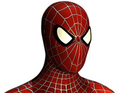
Spider-Man ZBrush model Final Turnaround

Spider-Man 2.0

Ok, so after getting my Spider-Man model critiqued, I went back into zbrush and worked on the anatomy some more. The results i am happy with and I am ready to moved onto the next model. :)

Thursday, August 5, 2010

New Render of Spider-Man

I fixed most of the Uvs and adjusted the proportions a little more for this model. I also played around with the depth of field effect for the camera in 3ds max.


Spider-Man in Times Square (Click for High-Res)

Wednesday, August 4, 2010

Everyone Makes Mistakes

Here are a few flaws I found when looking closer at my Spider-Man model. They are easy fixes, Thank God! I just have to shorten the head and work on the UVW's
Seams got messed up when using the symmetry modifier. :/
The webbing is slightly different sizes, when close up.

Spider-Man Renders

Here is the refined renders. Rendered in 3ds Max and then touch ups in Photoshop.

Original Spider-Man Costume. (Click For High-Res.)


Symbiote Spider-Man Costume. (Click For High-Res.)
Add caption

Does whatever a Spider can....

Here is a model that I have been working on for a few weeks. I really want to improve upon my 3d work, as well as add new things to my demo reel and portfolio. So I figure why not model characters that everyone knows to the best of my ability. Here are a few shots that I saved of the progress work. Then the post after this I will post the refined images.
Screen shot of the W.I.P of Spider-Man
Test Render of Spider-Man, The bump map was way too strong.

The maps used in the model of Spider-Man. Done in photoshop & ZBrush.

New Work in The Works

Here is a 3d model I made a month ago from the Egyptian Cat design I made a few years ago. It was both fun, and a pain to work with the hair and fur modifier in 3ds max because you need a ridiculously powerful computer for the program not to crash.

Wednesday, June 16, 2010

NEW! VOTE FOR MY SECOND DESIGN!

 LADY BAWKBAWK IS A GIANT CHICKEN! A GIANT CHICKEN I TELL YOU!!.......lets see how long this one takes to get pulled......

Lady BawkBawk - Threadless, Best T-shirts Ever

VOTE FOR MY T-SHIRT DESIGN!!!

This design was just made for fun, for my friends Laney Wunderli & Jennifer McMahon and their blog http://ehmybody.blogspot.com/ . But It was brought to my knowledge that this would be a cool design for a T-shirt and was advised by Laney Wunderli to put it on this website for a chance to be made into a T-Shirt. So GO VOTE for my design and make sure to visit http://ehmybody.blogspot.com/ to see other awesomely gruesome drawings by other very talented artists!

Engh....My Delicious Body! - Threadless, Best T-shirts Ever

Friday, June 11, 2010

Lady Bawk Bawk

With looking for a job, and searching for companies I leave the T.V on until it gets too annoying to listen too. I had MTV on (ugh) and they were having this segment on how weird lady gaga is or something, and how she might be a man. This reminded me of Chicken Boo from Animaniacs for some reason, and BAM lady bawk bawk. SHES A CHICKEN I TELL YOU!!! A GIANT CHICKEN!!

Fan Art

This is a drawing I made for my friend Sean Sullivan, He posted this cool drawing hes working on of a tree like character in a swamp. I liked it so much I wanted to make my own interpretation.

You can view more of his work, on his blog at http://seanpatsull.blogspot.com/  A.K.A The Abominable Snowman's Kick-ass Slumber Party!


Sfumato

I got tired of drawing cartoons for a while, So I thought I would try something a little harder. I wanted to brush up on my light and shadow, So this was a half hour sketch done in Photoshop.

Engh......MY BODAAYYY....

Ok......This is a drawing I did for my friends Laney Wunderli & Jennifer McMahon who started this blog of which you draw a disgusting/weird/disturbing body according to the sound clip which says "Engh, My Body" in a elderly/fat kid/wining (That's what I got out of it) Below is what I came up with. It also entails an inside joke they told me about there time spent at a Dairy Queen.........Enjoy?

ALSO PLEASE VISIT THE BLOG AND VIEW THE DISTURBING IMAGES + CONTRIBUTE A PICTURE !!! http://ehmybody.blogspot.com/

Puck Drawing

A drawing I did for my friend Michael Meara. His character Puck fighting Mad Kactus! This was my rendition of his two characters. I want to draw another one, because they are so interesting. You can see more of his work, and other peoples renditions of his characters on http://puckandfriends.blogspot.com/

Thursday, May 13, 2010

Portfolio Items: Continued...

Here are my Portfolio items stamped with my "Self-Marketing Brand". I'll start with a few Business card designs that I used in the show.


My Cd stamp which was printed onto the Cd's I passed out at the show. The Cd's had my two demo reels, a copy of my resume and all the images used in my Book portfolio.And lastly, but more importantly, My resume. I'm still going to play around with all these images...as well as my "Branding". My website is JohnGreenAnimation.Net......It still needs some tweaking (I dont know HTML or website making) but its good for now....

Portfolio Images

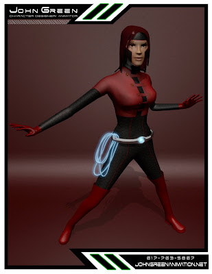
Here are a few sheets from my book portfolio. We had to come up with a brand to market ourselves. I didn't want it to be really cluttered so or blinding, So I went with three colors, Black, White and Green. Of course the color Green, I beat the concept into people the whole time I was in that class and at the Portfolio show. The three 3d models below I am currently re-modeling because I am learning Zbrush, and it is a great tool to learn! Its confusing at first but worth the time.


I GRADUATED FROM COLLEGE!!! WOOOT!

This past Saturday (May 8, 2010) I graduated from The New England Institute of Art with a Bachelor of Science in Media Arts & Animation.

I had been really busy with getting things together for my last two classes (Internship & Portfolio class). We had to gather all of our work and put it in presentable packages to display at a portfolio show we held this past April. Business cards, a Website, resume, demo reels as well as a booklet of all our best work. I will make sure to post pictures!

For my internship class, I had to get a internship (Duh!). I am currently at a company called Pangea Tools in Waltham, MA. They are a brand new company that specializes in creating educational software for kids in grades K-12. My position is to organize, compile, create & edit images for use in the software. I started at the beginning of March and I'm contracted till the end of May (The 31st). To be honest, not the ideal job, because I'm not animating, But it has been a valuable learning experience in a professional production team

Monday, January 11, 2010

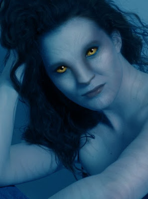
Avatar Photo Manipulation

I just saw Avatar for the second time... Possibly the best movie I have seen. Also Its very inspiring, especially for an animation student. Any who, my sister (Una Green) wanted to know what she would look like as an avatar. So I took one of her photos and played around with it in Photoshop. Below are the results.

Tuesday, January 5, 2010

Production Team: Production Work

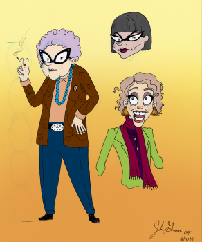
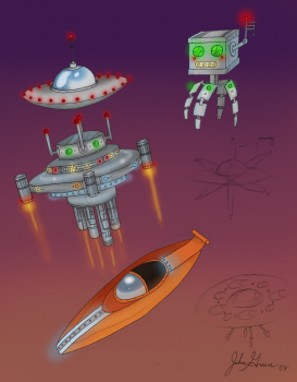
Here are a few designs that I made for my production team class. Among the many alterations made from the client at the Coolidge theater. We went from our own thoughts, mine being the old west theme. from there we went to a magic theme, and then we finally pleased the client with a Alien theme. One of my many jobs within the group was to design and model an old woman who would be one of the people in the movie theater, as well as the spacecraft that the aliens would come in. Here are some of my designs that were made! Enjoy